
The Colors Heading Into Midwest Homes in 2026
Published by Reliable Renovations | February 2026
If you've been living with the same wall colors since you moved in, here's your sign. Benjamin Moore just released their Color Trends 2026 palette and it's the kind of lineup that makes a remodel feel overdue.
We use Benjamin Moore paint on nearly every project we take on. Not because it's trendy. Because it holds up, covers well, and the color accuracy is unmatched. So when their color team releases a forecast, we pay attention and so should you.
The Anchor: Silhouette AF-655
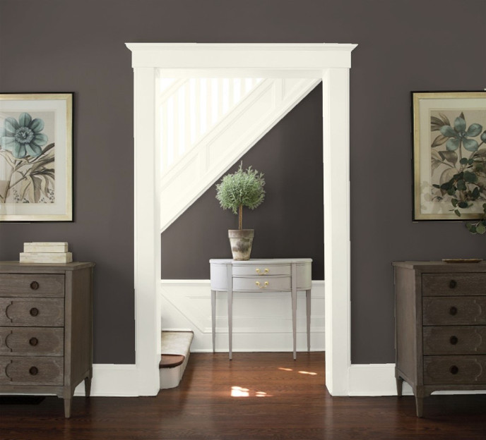
Benjamin Moore's 2026 Color of the Year is Silhouette AF-655 — a deep, rich tone that blends burnt umber with subtle charcoal undertones. Think of it as the sophisticated middle ground between brown and near-black. Warm without being heavy. Moody without being dark.
This is not a color for the timid. It's a color for the homeowner who's done playing it safe.
Where it works best: entryways, primary suites, accent walls in living rooms, or kitchen cabinetry paired against lighter countertops. Done right, it's the kind of color that makes guests stop in the doorway.
The Supporting Cast
The full 2026 palette gives you eight colors built to work together across your entire home. Here's how to think about them room by room:
Raindance 1572 — A pale, easygoing blue-green with gray undertones. Ideal for a home office, laundry room, or powder bath. It recedes and calms, letting the room breathe.
First Crush CSP-310 — A muted, dusty blush. Not pink. Not mauve. Somewhere in between, and better for it. Works beautifully in a primary bedroom or reading nook.
Batik AF-610 — A dusty mauve that bridges the warm and cool ends of the palette. This one photographs well and layers naturally with wood tones — relevant for northern Illinois homes with hardwood floors.
Southwest Pottery 048 — A muted clay red. Bold, but grounded. Works as an accent wall in a dining room or on an interior door for a hit of warmth you didn't know you needed.
Sherwood Tan 1054 — An earthy, mid-toned tan. Versatile enough for walls, trim, and cabinetry. Northern Illinois homeowners with craftsman-style homes will recognize this one immediately.
Narragansett Green HC-157 — A classic, slightly grayed green from Benjamin Moore's Historic Colors collection. Timeless. Works in kitchens, mudrooms, and built-ins alike.
Swiss Coffee OC-45 — The anchor white of the palette. Warm, not stark. Pairs with every other color in this lineup, and makes trim and millwork look intentional rather than just painted.
How This Works for a Whole-Home Remodel
The smartest thing about this palette is that it's designed to flow. You're not picking one color — you're building a system. Light, airy tones in high-traffic spaces. Deeper, richer tones in rooms where you want presence.
A practical approach for northern Illinois homes: use Sherwood Tan or Swiss Coffee as your foundation through the main living areas, pull Raindance into a secondary bedroom or bath, and let Silhouette do the heavy lifting in one or two feature spaces. The result is a home that feels cohesive — not like five different people made five different decisions.
Paint is one of the highest-return investments you can make during a remodel. The palette is already figured out. The only decision left is who you trust to apply it.
Reliable Renovations serves homeowners across northern Illinois. We use Benjamin Moore and Sherwin Williams paints exclusively — because quality matters more than a cheap bid.